


The Art with Heart Team ladies are selecting their favourite colour combinations to share with you tonight. Choosing the right colour scheme can be essential to your design and with Stampin’ Up!s stunning collection, there are 50 colours to choose from. There’s sure to be some combinations that work really well together and you can take inspiration from.
Now sit back and enjoy some time out of your day to cruise through our blog hop and soak up some colour explosion eye candy!
I love colour and discovering new combinations that work. Colour can be soothing, uplifting, fun. It can evoke memories and emotions.
When I first joined Stampin’ Up as a hobby demonstrator I wanted to add some inks to my sign up kit. But which ones to choose? I knew I wanted them to be versatile and suit a range of themes and stamp sets. Now of course the deeper you delve, the more you learn and change, but I needed to start somewhere. I was drawn to the Brights Collection first. What could be happier, brighter or more fun? A beautiful rainbow of colours. And to be honest, what drew me to that collection, were two colours: Melon Mambo and Bermuda Bay! I love these two colours together, they are so bright and happy, I find myself returning to these two colours a lot!
Today I am sharing 3 cards using these two colours as the main colours! 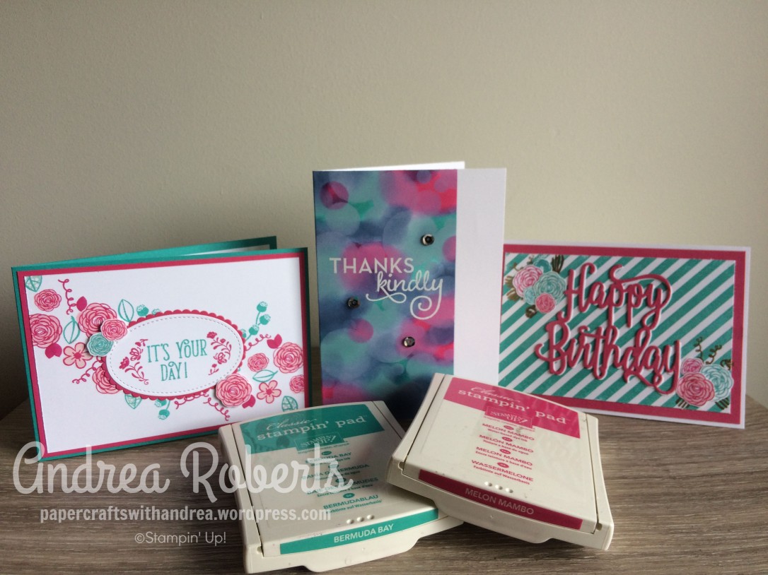
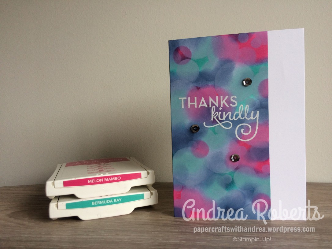
My first card was using the Bokeh technique:
 I was inspired by an ATC swap I did with some of the other Art With Heart Team members. To make this card I masked off the edge of the card with long sticky notes and sponged on the colours. I added in a little bit of Night of Navy to the Melon Mambo and Bermuda Bay. The Bokeh circles were added by using the White Craft Ink and the sentiment also used the White Craft Ink and was heat embossed using White embossing powder. To finish off the card I used a few silver sequins.
The next card I wanted to make bright and happy, and I also used the Happy Birthday Thinlit die. 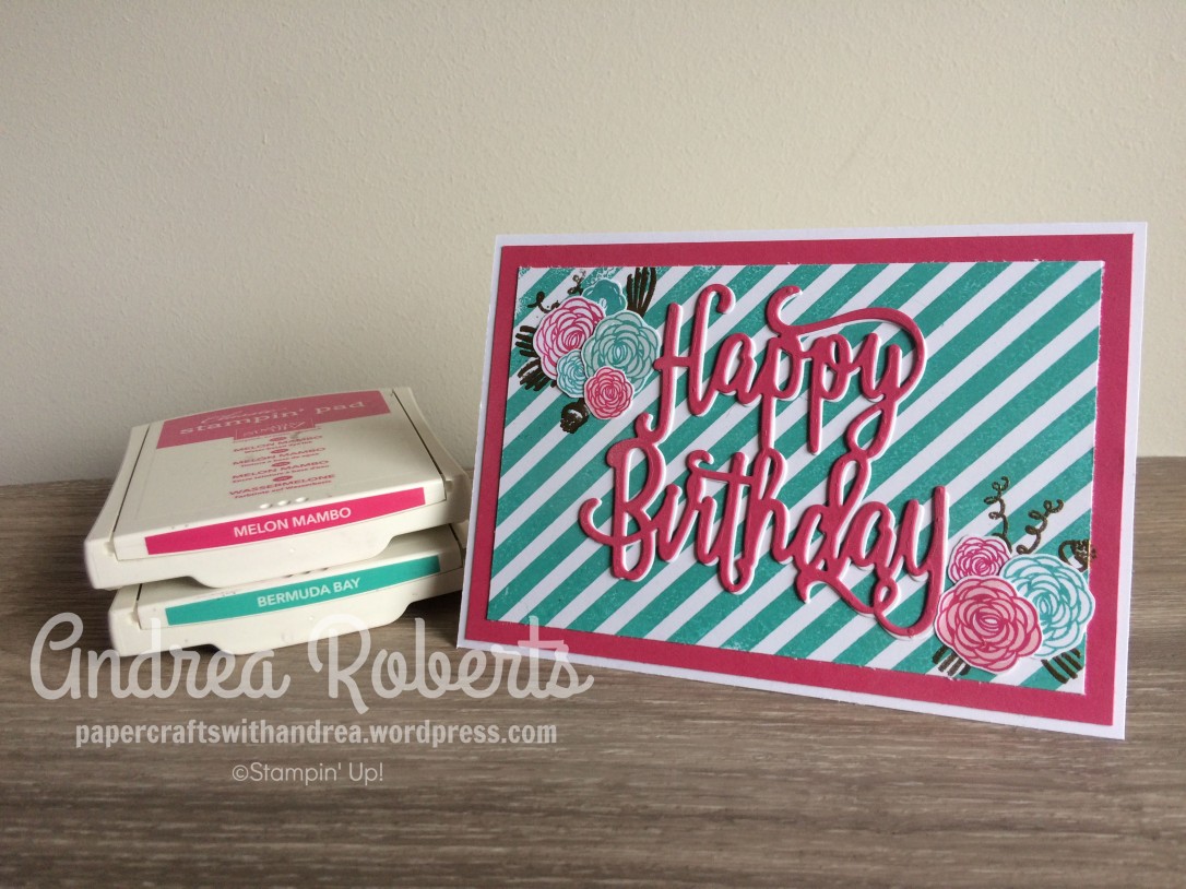
I stamped the background using the Diagonal Stripe Clearmount stamp. The flowers are fromthe Happy Birthday Gorgeous stamp set. I stamped the pink ones in Powder Pink for the solid image and then the detailed stamp using Melon Mambo. The other ones were stamped in Pool Party for the solid image and then Bermuda bay for the detailed stamp. A few of the larger flowers don’t have the solid colour underneath. I then fussy cut all the flowers and heat embossed the background elements in Gold. The thinlit die is layered with a slight offset. The background image is Whisper White, while the main focal diecut is Melon Mambo.
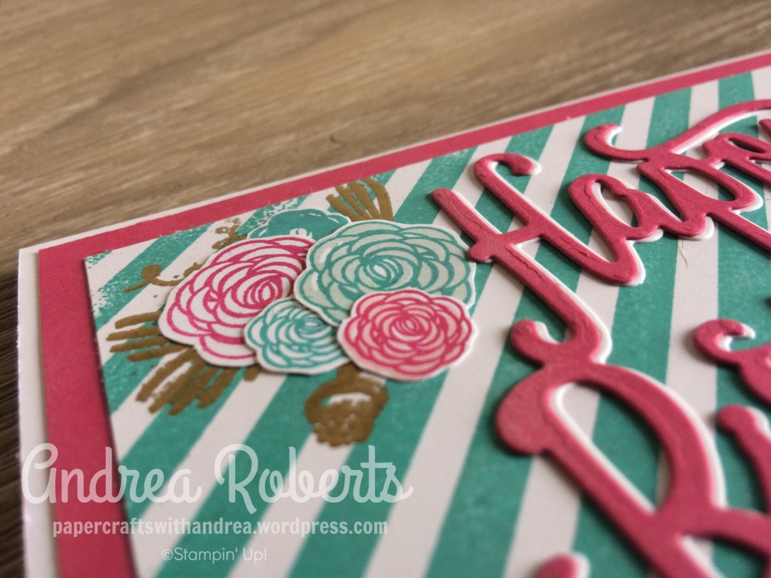
Here is a close-up of the layered flower elements and also the layered Happy Birthday sentiment:
My last card that I am sharing for the blog hop also uses the Happy Birthday Gorgeous stamp set (can you tell that I love this set?). I wanted a “prettier” look for this card, so I cascaded the flowers from top to bottom corner.
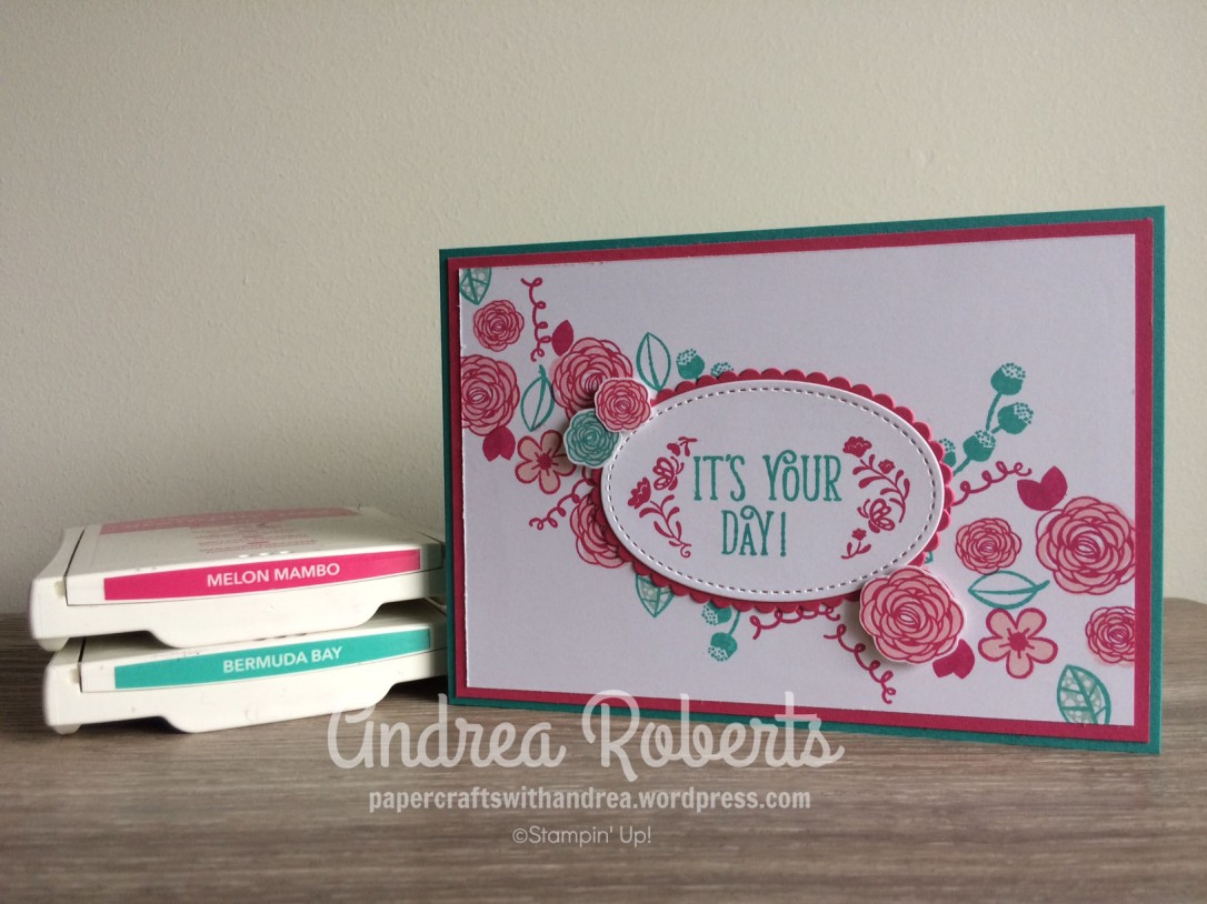
I used the same colour combinations before the pink flowers are Powder Pink and Melon Mambo, the blue flowers are using Pool Party and Bermuda Bay. I fussy cut 3 of the flowers and mounted them on SU Dimensionals. The sentiment I stamped in 2 parts to fit it in the Label Me Pretty stamp. Instead of the Label Punch I used the Stitched Oval and die cut the Scallop oval in Melon Mambo.
I used a Melon Mambo mat on a Bermuda Bay base for the card. I also stamped inside the card on a piece of Whisper White:

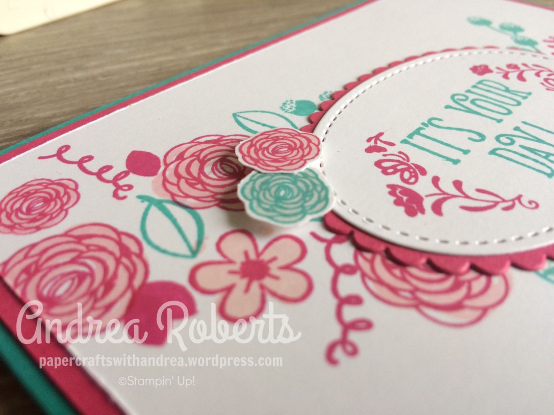
A close up of the flowering cascade and the raised flowers:
Thanks for visiting today! I’m sure you will see some amazing colour combinations from the other Art with Heart ladies. Next up is the lovely Rebecca! 
1. Catherine Proctor
2. Sharon Davern
3. Tina Gillespie
4. Kathryn Ruddick
5. Andrea Roberts << you are here >>
6. Rebecca Jacovou
7. Monika O’Neill
8. Caroline Manwaring
9. Rachel Woollard
10. Kimberly Hern
11. Ros Davidson
12. Amie McIlroy
13. Kate Morgan

Ow wow, I love all your cards, Andrea, but I especially love the last one! I love how you went diagonally across the card and fussy cut some of those flowers to create the layers!!!
LikeLike
Andrea, all your cards are totally gorgeous!!! I do especially love your last card soo pretty xx
LikeLike
Andrea your cards using these colours just make me very very happy. love them all.
LikeLike
Oooh, what a gorgeous combo! So bright and happy. Like the others, I especially love the final card.
LikeLike
Wow, Andrea, your cards are gorgeous! Such a beautiful, happy colour combo (that I don’t know if I’ve ever used); thanks for the inspiration. 🙂
LikeLike
Beautiful cards, Andrea. I especially love the ‘It’s your day’ card. My first ink set was also the brights but Bermuda Bay was part of it back then, so this colour and I are only just now getting acquainted, can’t believe I ignored it for this long!
LikeLike
What a great colour combination Andrea they look fantastic together. Your cards are beautiful!
LikeLike
Absolutely gorgeous cards Andrea. Your colour combination is beautiful and the softness of the bokeh technique is exquisite. Love them all! 🙂
LikeLike
Fantastic colour combo Andrea, and I love your Bokeh card and the It’s Your Day card – I MUST get out the Happy Birthday Gorgeous stamp set and USE it! LOL
LikeLike